
From Protective's official Logo Launch video, with art direction by Paige
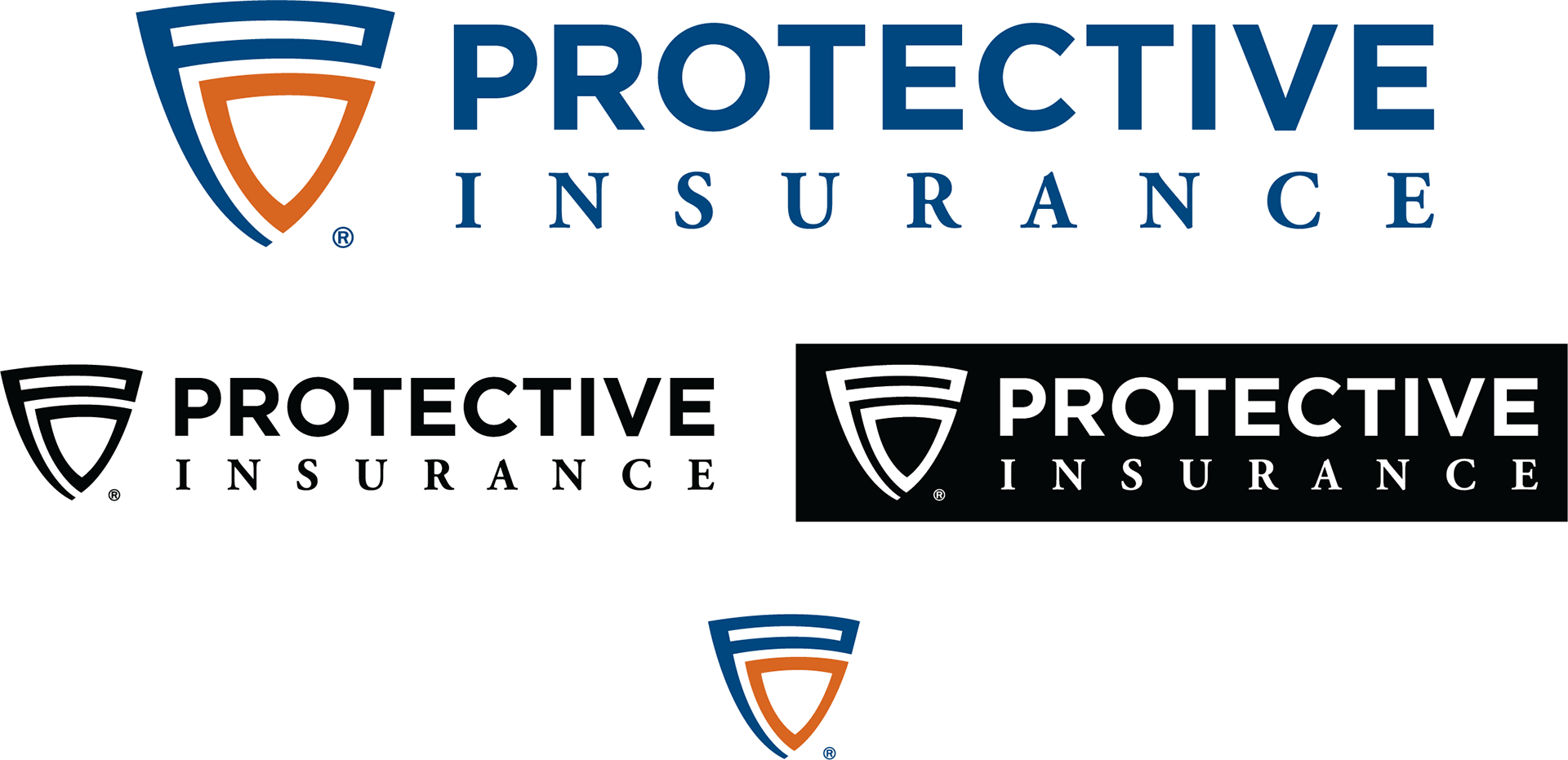
Logo
Protective Insurance decided to rebrand from their old name Baldwin & Lyons, Inc. in early 2017. First came the logo, and the full brand was thoughtfully built-out over time.
I wanted Protective to be represented by a shield to highlight the most important role insurance plays to its customers. The letter P is hidden within the shield itself to strengthen its ability as a stand alone icon.
Colors
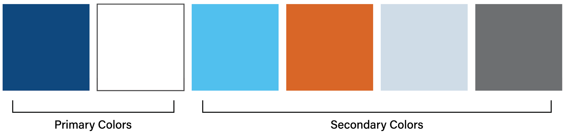
The color palette was selected to show strength, wisdom and energy to reflect on the company's
100-year history but renewed focus on its future.
100-year history but renewed focus on its future.
Fonts
Offering customized insurance solutions (v. off the shelf offering from our competitors), a handwriting font was selected for use in our marketing materials.
Franklin Gothic and Arial were also used.
